
Overlays, made practical.
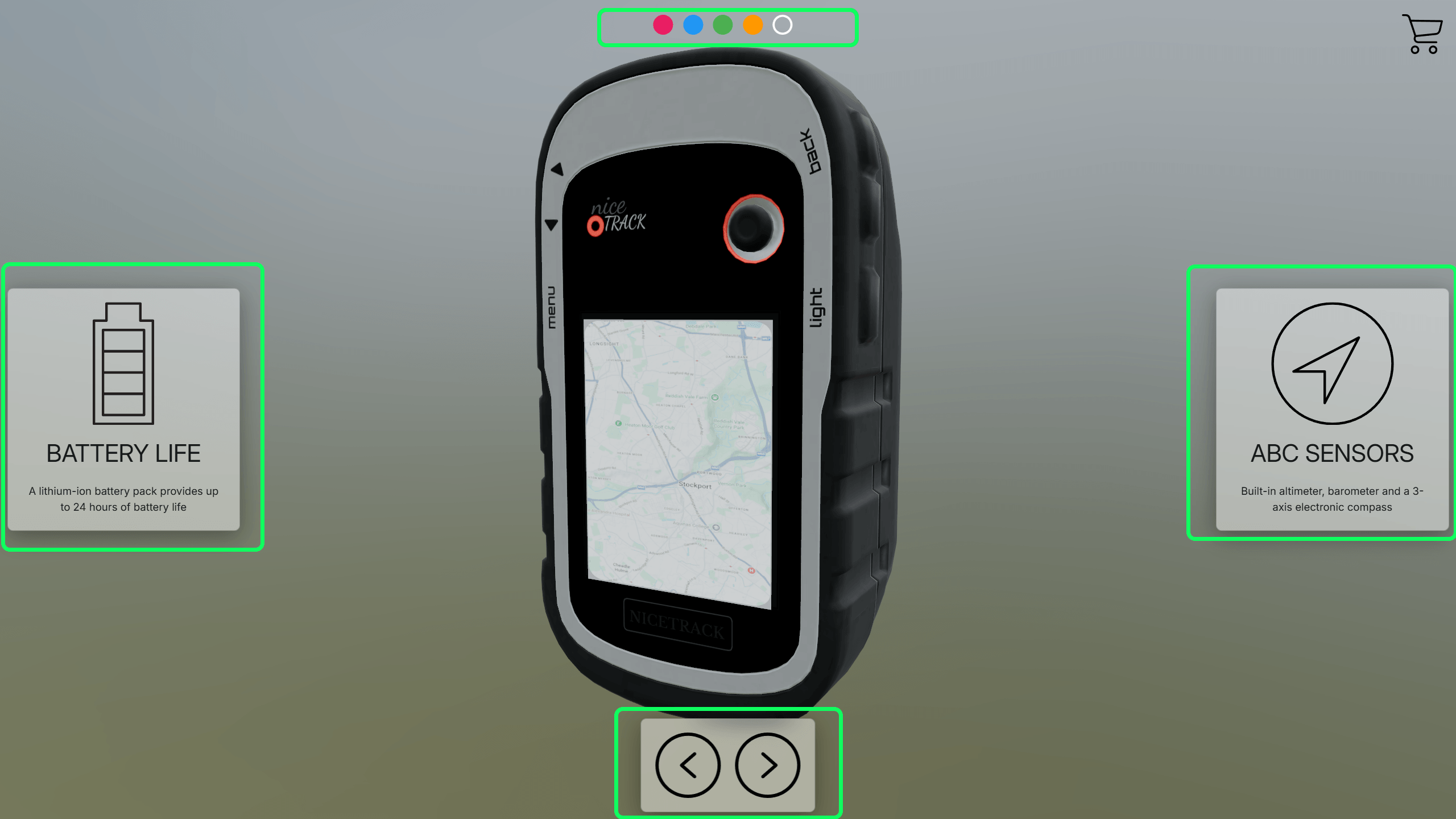
Overlays are panels that sit on top of the 3D viewer. They can explain a presentation step, show supporting images, or become a configurator control panel that changes the model.
Overview
What is an overlay?
An overlay is a screen-based panel rendered above the 3D canvas. Unlike 3D text or hotspots, an overlay stays in the viewer interface. You decide where it sits, how wide it is, whether it has a background, and how it behaves on smaller screens.
Overlays are attached to snapshots, so they are especially useful for guided presentations. When the viewer moves to a snapshot, the matching overlay can appear with the information or controls needed for that step.
The main idea
Overlays are the user interface layer for your viewer. They can be read-only, interactive, or a mixture of both.
Why use them
Use overlays for explanation and control.
Presentation panels
Use overlays to explain what the viewer is looking at. A snapshot can show a title, notes, labels, images, calls to action, or a short guided step.
Configurator controls
Use overlays as the visible control panel for a product configurator. Selects, switches, buttons, and colour pickers can send values into actions.
Reusable layouts
An overlay can be linked into more than one snapshot. Edit the linked overlay once and the shared snapshots update together, or break the link when one step needs its own version.
Create one
A typical overlay workflow
Create or select the snapshot where the overlay should appear.
Open the overlay area from the right sidebar and choose Add overlay.
Give the overlay an editor name so it is easy to find later.
Set the position, width, columns, background, text colour, animation, and mobile behaviour.
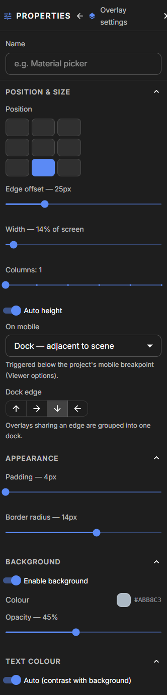
Add controls such as text, images, buttons, selects, switches, checkboxes, or colour pickers.
Bind interactive controls to actions if the overlay should change the 3D scene.
Save the project, then republish when the overlay should appear in the public viewer.
Overlay settings
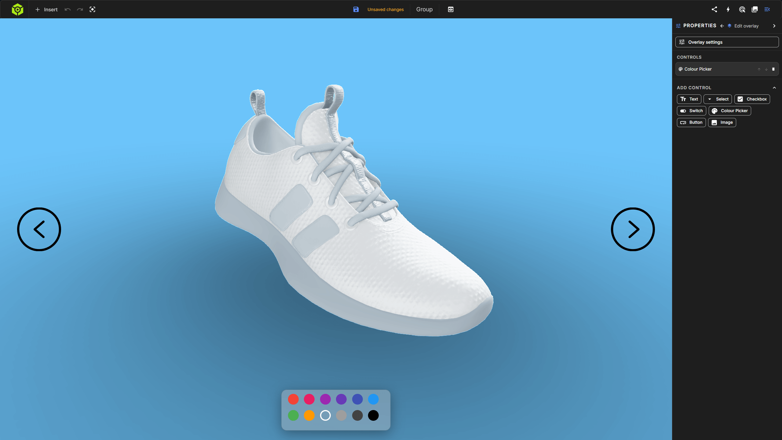
The panel settings control how the overlay behaves.
Position chooses one of the nine screen anchors. Width, height, columns, padding, and radius control the layout. Background and text colour control readability. Animation controls how the panel enters and exits. Mobile behaviour decides whether it floats, docks beside the scene, or hides below the project's mobile breakpoint.
Controls
What you can put inside an overlay
Each overlay contains controls. Some controls are there to communicate, such as text and images. Others can send values into actions, which is how an overlay becomes a configurator.
Text
Adds headings, body copy, captions, or short notes. Text can be purely informational, or it can link to a URL, a snapshot, or an action when clicked.
Image
Adds a product image, logo, diagram, or supporting visual. Images can be sized, aligned, given alt text, and optionally made clickable.
Select
Gives the viewer a dropdown choice. This is useful for alternative sets, finish ranges, model variants, or any action where the action value should be a named option.
Checkbox
Sends a true or false value. Use it for optional parts, add-ons, simple visibility states, or binary material choices.
Switch
Works like a checkbox but presents as a toggle. It is a good fit for on/off controls such as show wheels, include arms, or enable an accessory.
Colour picker
Lets the viewer choose a colour. Bind it to a material action when the selected colour should update a part, material group, or selection set.
Button
Triggers an action, opens a URL, or jumps to a snapshot. Buttons are best for deliberate commands like reset view, request quote, or show exploded view.
Bindings
How overlays connect to actions
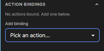
Actions do the actual scene work: show or hide parts, change a material, switch an alternative, activate a snapshot, or play an animation. Overlay controls are the buttons, switches, dropdowns, and colour pickers that send values to those actions.
Bind the control
Choose the action that should receive the control's value. A switch might send true or false to a visibility action. A dropdown might send a label to an alternative action.
Map values when needed
A value map translates what the control sends. For example, a visible dropdown label such as Graphite can be mapped to a material value, or a checked switch can be inverted.
Mobile and snapshots
Keep overlays comfortable on every screen.
Mobile behaviour
Show keeps the overlay floating over the viewer. Dock moves it next to the scene on smaller screens. Hide removes it from mobile when it is not essential.
Linked overlays
When an overlay is linked across snapshots, edits to that overlay update every linked snapshot. Break the link when a snapshot needs a different version.
Use one overlay for one job. A short explanation panel is easier to understand than a busy all-purpose panel.
Name overlays clearly in the editor, especially if you plan to link them across snapshots.
Use Dock or Hide on mobile when a floating panel would cover too much of the model.
Create actions first when the overlay needs to control visibility, materials, alternatives, snapshots, or animations.
Use value maps when the visible control value needs to translate into a different action value.
Republish after overlay changes if the public link or embed should show the update.
A good overlay helps the viewer do the next obvious thing.
Keep presentation overlays short, keep configurator controls focused, and use actions for the actual scene changes. That split makes the project easier to build, test, and support.